Bites By Sweden
Project Overview
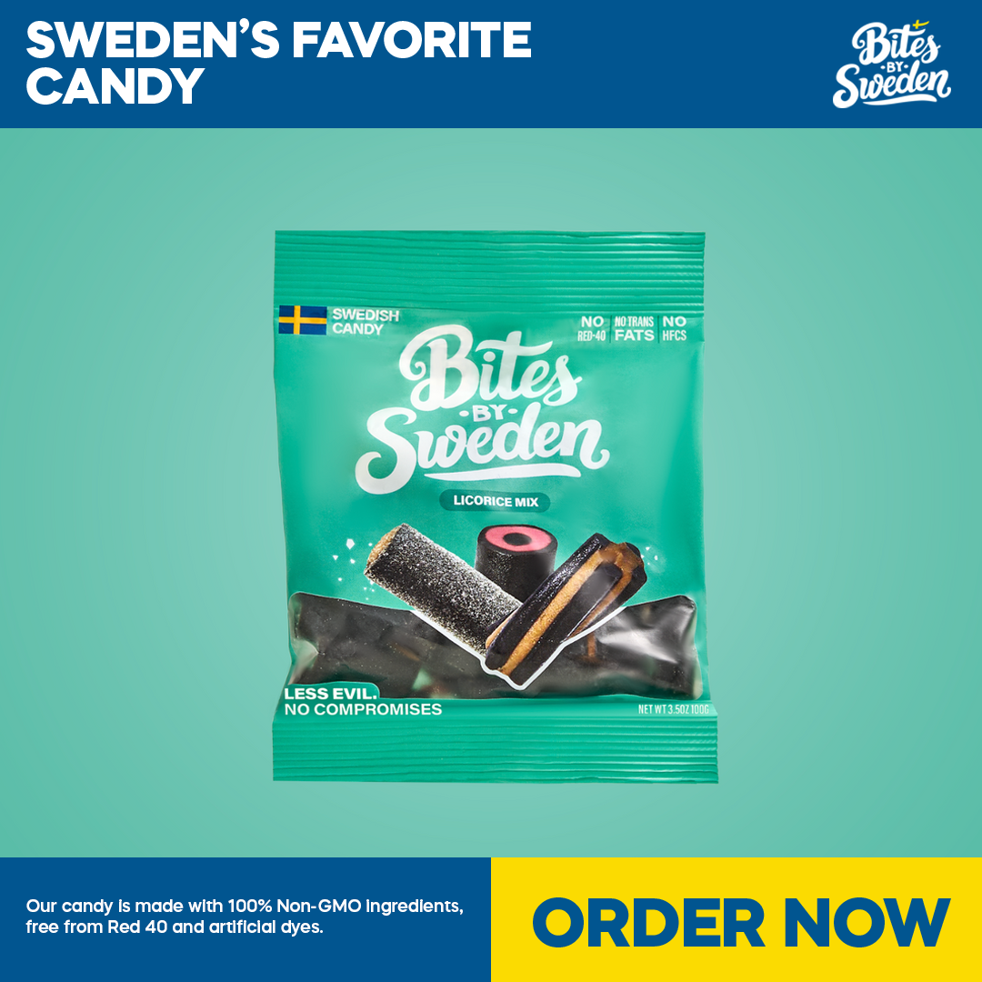
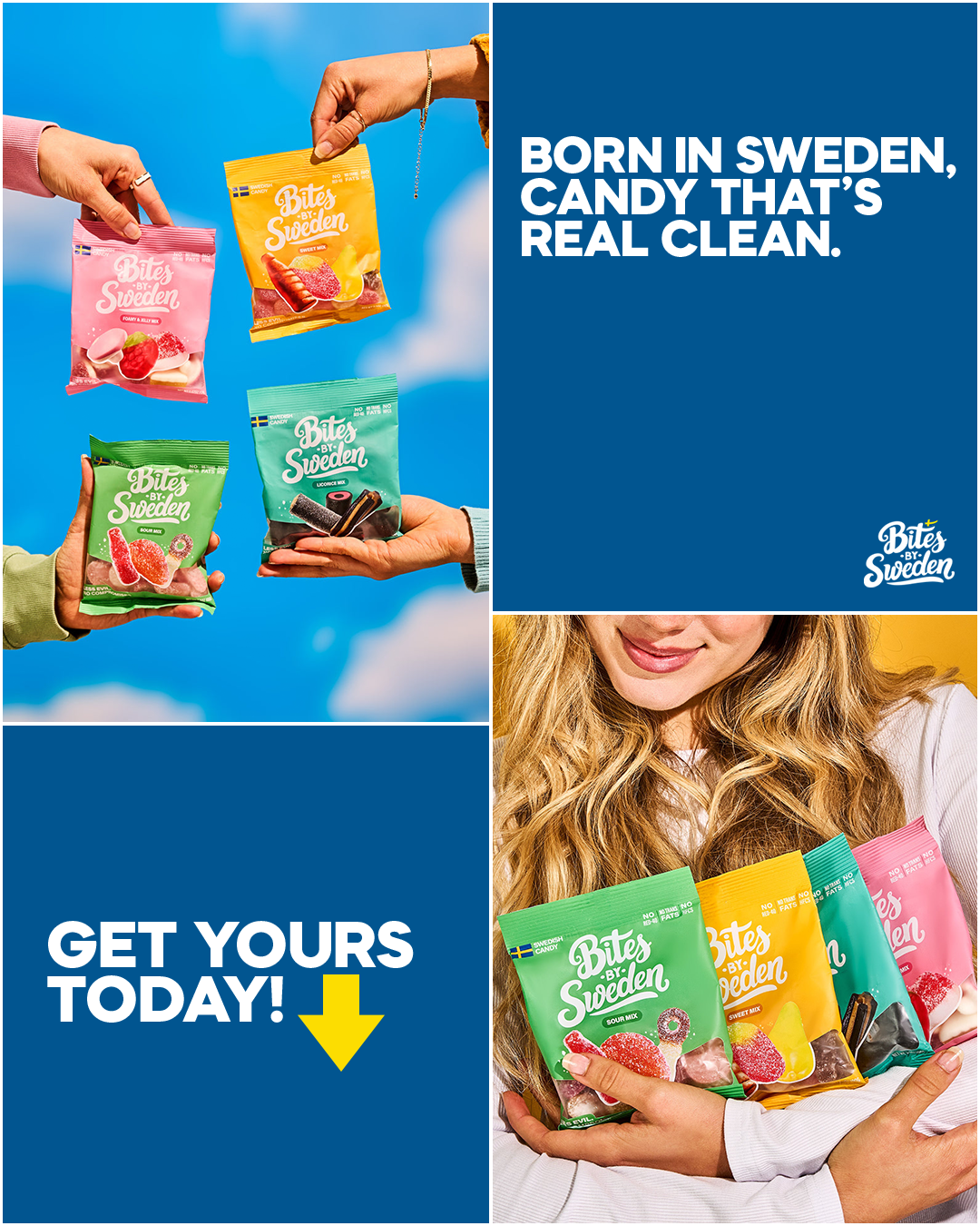
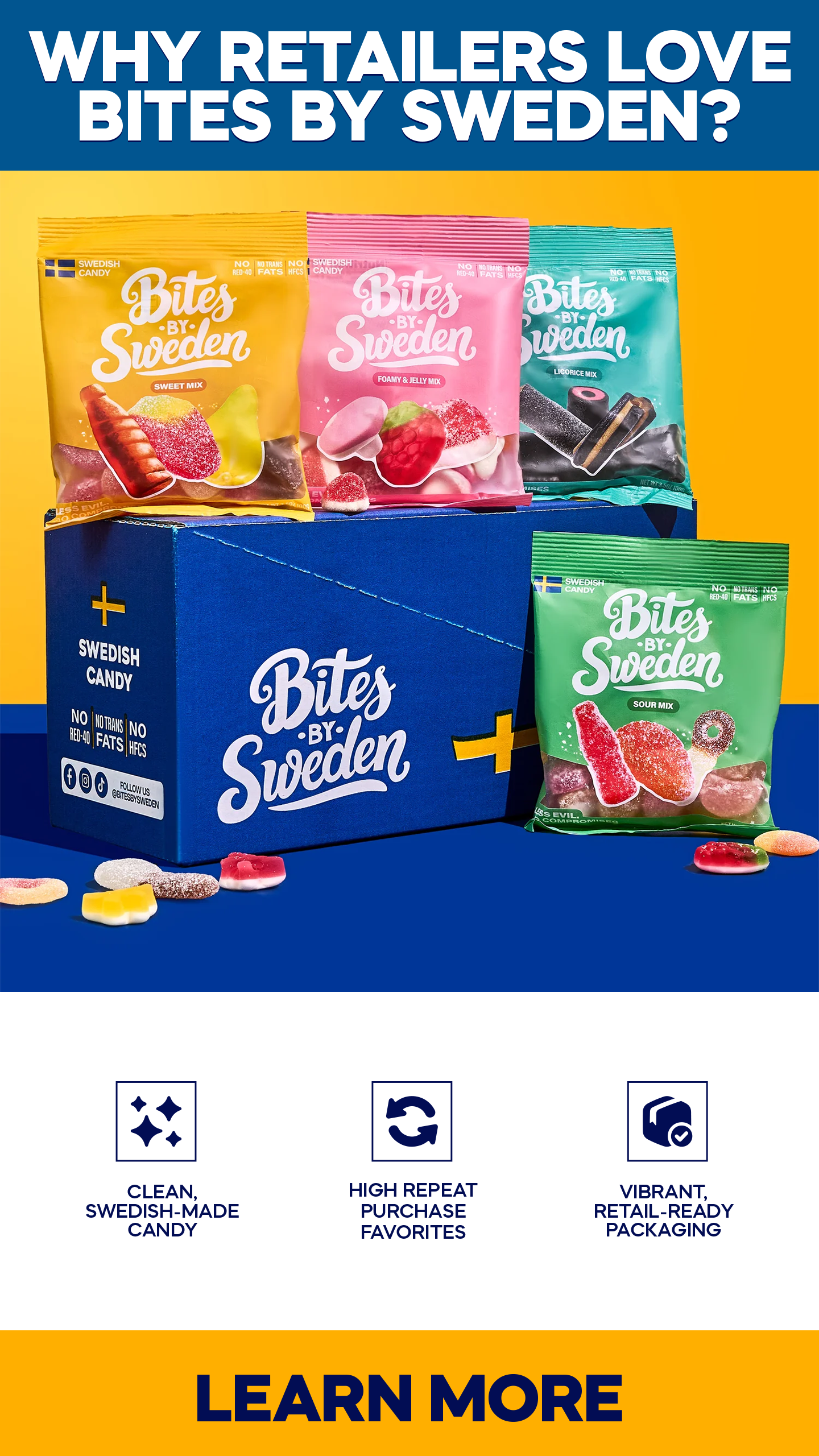
Bites by Sweden is a modern candy brand offering Swedish-made confections with a focus on clean ingredients, bold flavours, and vibrant, retail-ready packaging. The brand positions itself at the intersection of nostalgic candy culture and contemporary “better-for-you” values.
This project was completed as part of a design test for a remote Graphic Designer role, with the objective of creating static and animated Facebook ad concepts aligned with the brand’s visual identity.
The Challenge
Design a set of high-impact Facebook ads that:
•Clearly showcase the product and its packaging
•Align with the brand’s established colour system and tone
•Feel suitable for paid social placements
•Work across multiple ad formats (1:1, 4:5, 9:16)
•Balance attention-grabbing visuals with brand consistency
The brief emphasized creativity, visual appeal, and attention to detail, without prescribing specific layout templates.
Design Approach
My approach focused on brand-led restraint rather than over-stylization.
Key considerations:
•Colour blocking: Inspired by the brand’s website and packaging, using bold, flat colour fields to evoke a retro retail/catalogue feel.
•Hierarchy: Clear separation between headline, product focus, supporting information, and call-to-action to ensure readability in fast-scrolling feeds.
•Product-first layouts: Packaging and product imagery were treated as the hero elements, minimizing decorative distractions.
•Consistency across formats: A unified visual system was adapted across square, vertical, and feed-optimized layouts.
•Motion (exploratory): A short, minimal animation concept was developed using subtle fades and positional movement to bring the static design to life without compromising brand clarity.
Deliverables
•3 static Facebook ad concepts
•1:1 (square)
•4:5 (feed-optimized)
•9:16 (vertical)
•1 short animated ad concept (12 seconds)
•Brand-consistent typography, spacing, and CTA treatments
Stojo
Project Overview
Reusable Food and Drinkware Brand
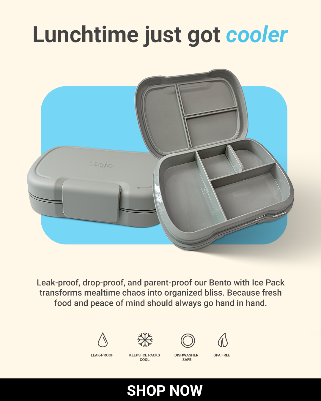
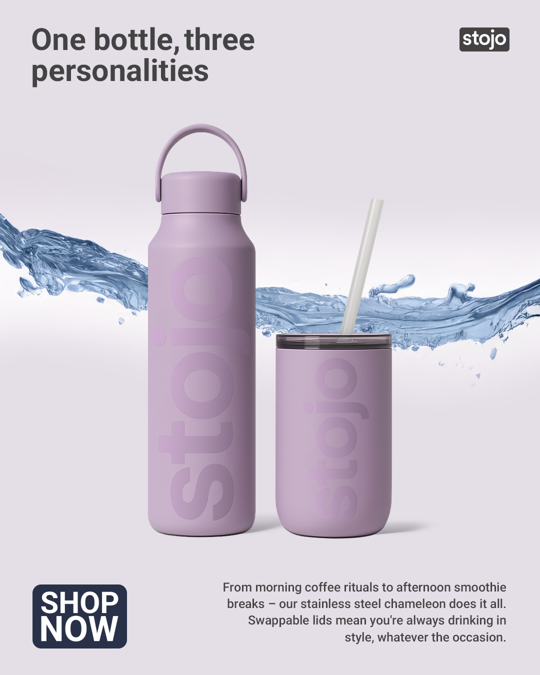
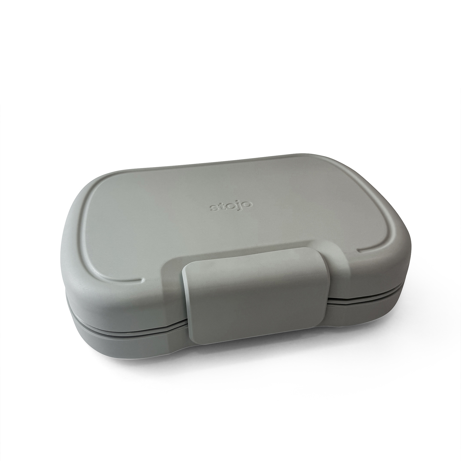
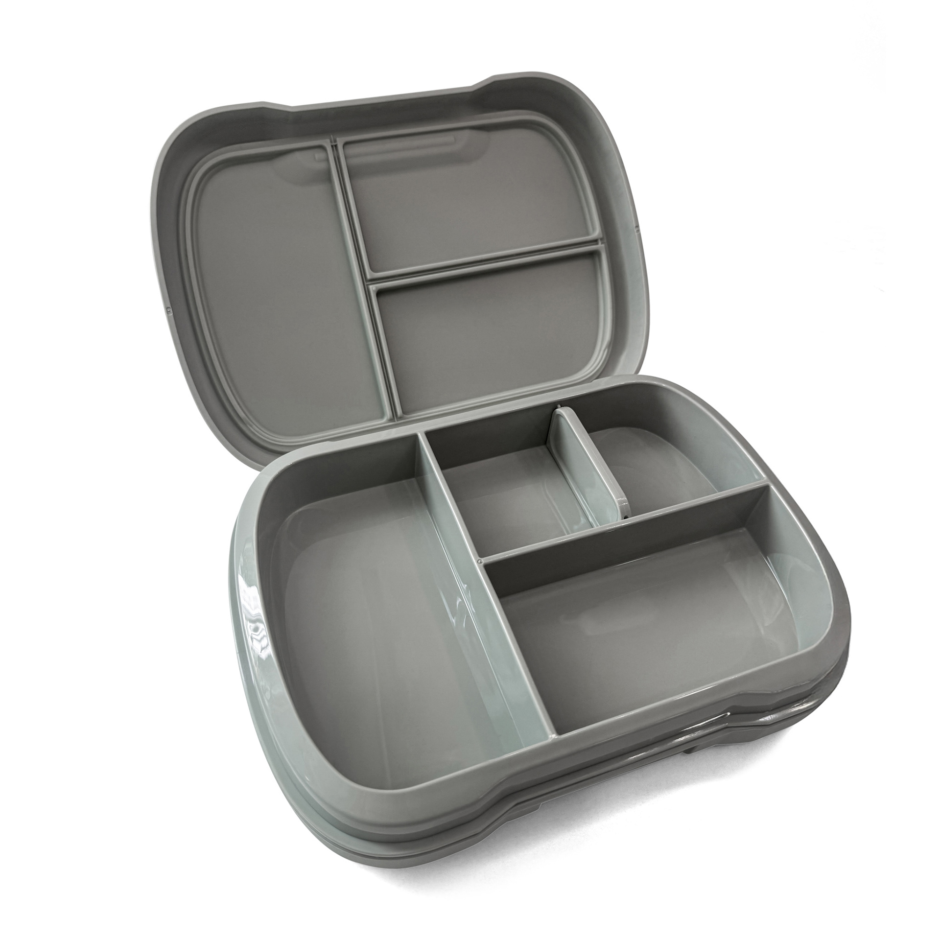
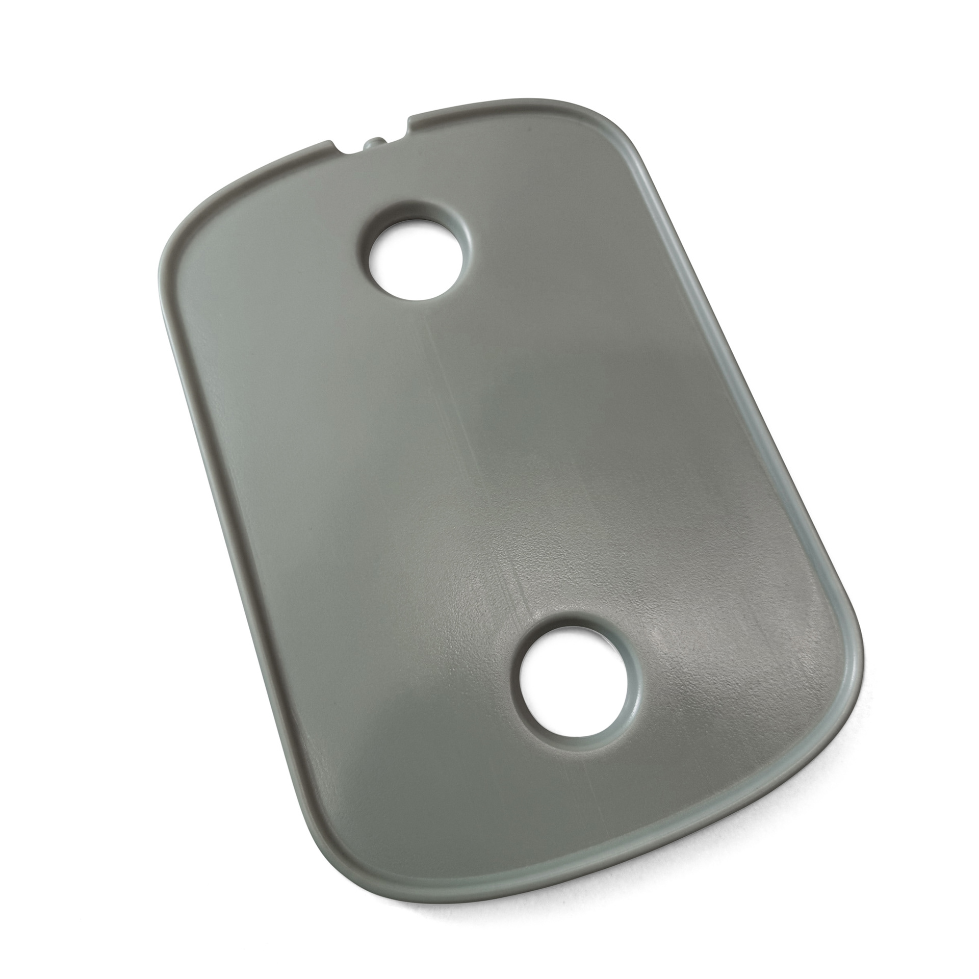
I developed exploratory concepts for a sustainable food and drinkware brand evaluating new digital advertising and shopify ready product photos. The goals were clarity at a glance, a premium feel, and flexible components that could roll out across social platforms.
I developed exploratory concepts for a sustainable food and drinkware brand evaluating new digital advertising and shopify ready product photos. The goals were clarity at a glance, a premium feel, and flexible components that could roll out across social platforms.
My role covered layout systems, image retouching, typographic hierarchy, and export/production. I built a modular grid, benefit-first copy, and scalable templates, delivering web-resolution assets and print-ready options to minimize prepress adjustments.
Bell Leisure
Project Overview
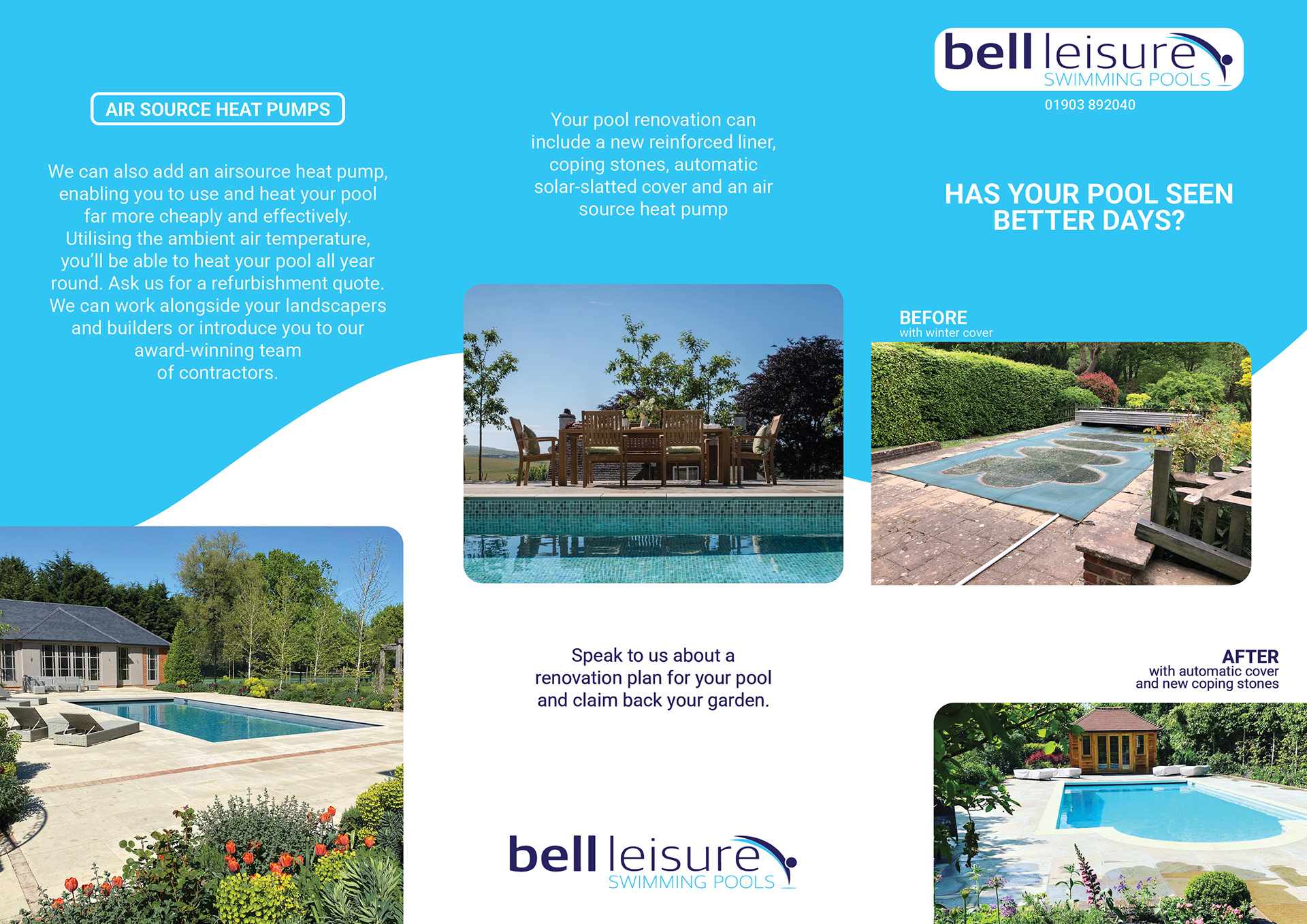
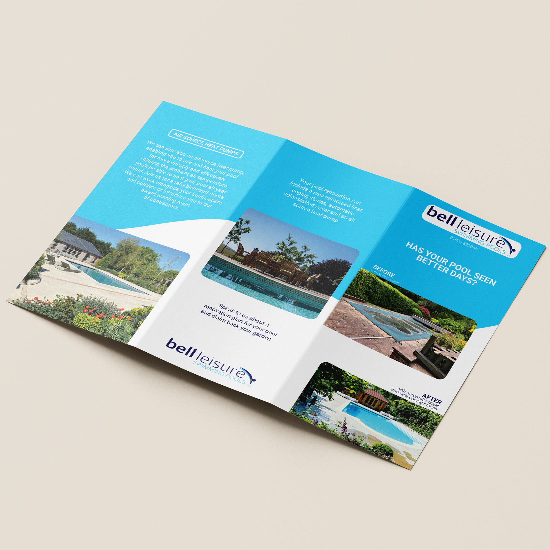
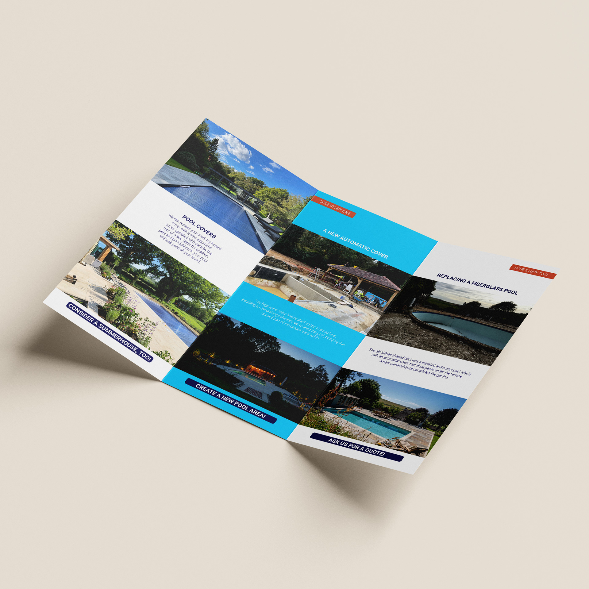
This is a one-time project, exploratory test for a print house company to design for them a A4 brochure for their client, Bell Leisure Swimming Pools. The brief was to make pool renovations feel immediate and worthwhile—while also introducing the benefits of air-source heat pumps—on a single, premium-looking sheet that aligned with the brand and printed cleanly.
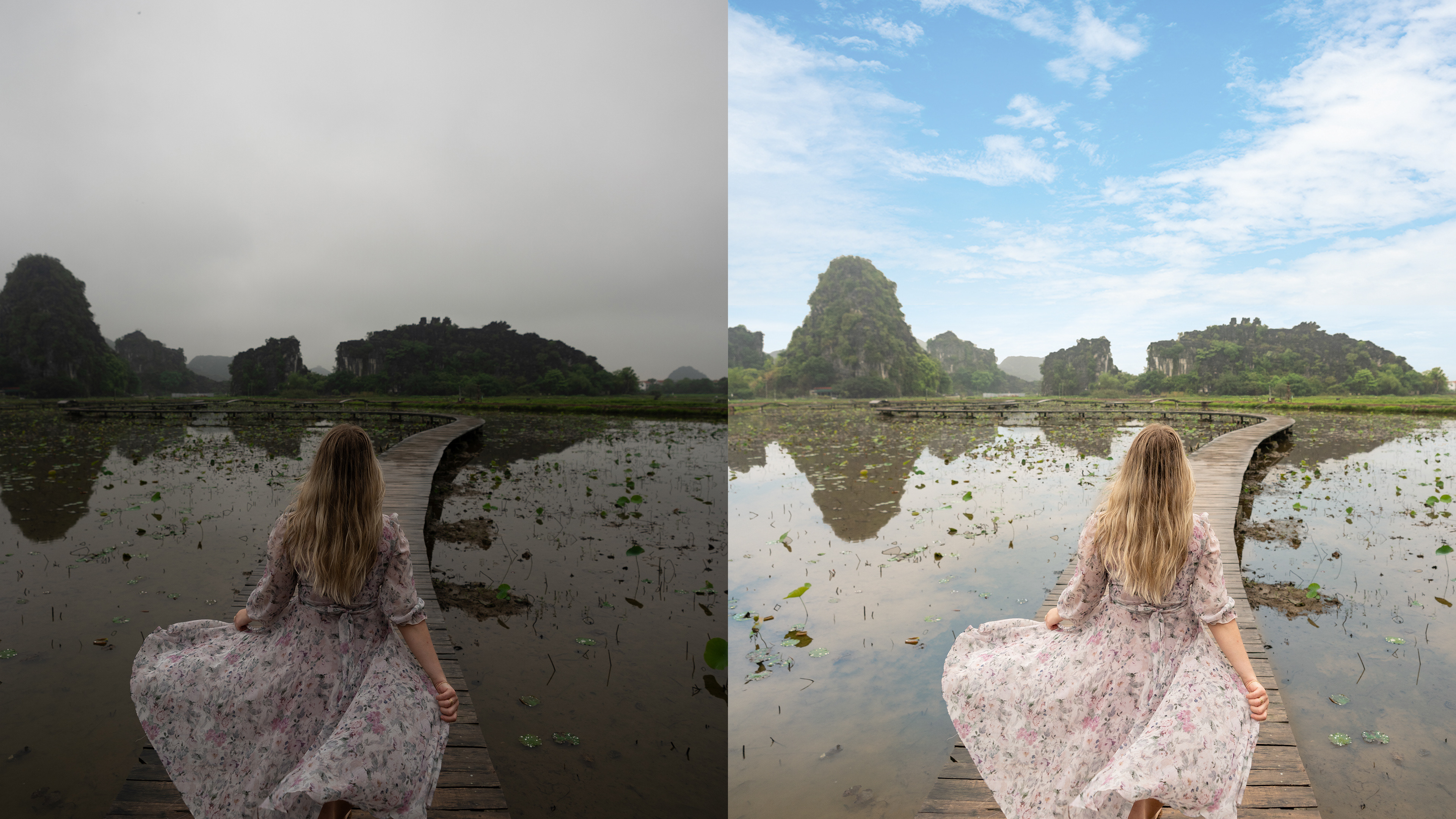
I led layout, image retouching, typography, and prepress. The concept centers on a question headline (“Has your pool seen better days?”) and a wave motif in Bell Leisure blue to suggest movement and guide reading. Clear before/after photography does the heavy lifting, supported by short, scannable copy blocks and a single, friendly call to action. Images were colour-balanced and sharpened for CMYK; margins, bleed, and type sizes were set for reliable press results.
The brochure neatly combines emotional proof (visible transformation) with rational value (efficiency gains from heat pumps), giving sales conversations a simple, visual starting point.
Heap Hosting
Project Overview
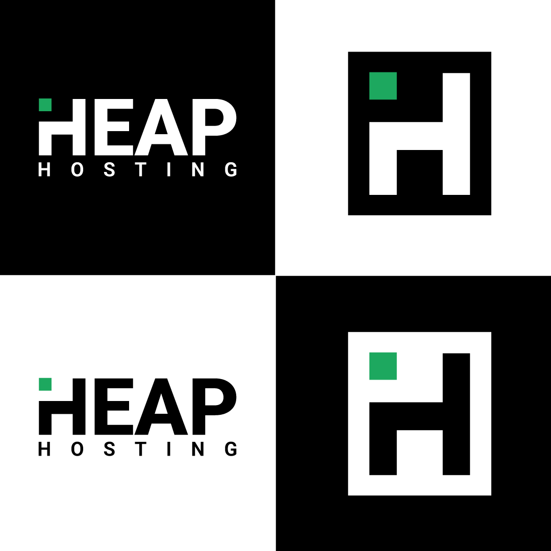
Heap Hosting is a fictional tech start up I developed as a creative exercise to showcase a complete brand identity system, from logo design to real-world applications.
On the logo design I decided to go on a minimalist and simplistic style approach as it reflects well on the company's mission to deliver an easy and not complicated system to start or host a website or a Virtual Private Server that caters to customers that are new and independent in setting up a hosting system. The green box shape signifies a digital cursor marking their relevance in the digital world and the green colour represents its product stability and a 24/7 service.
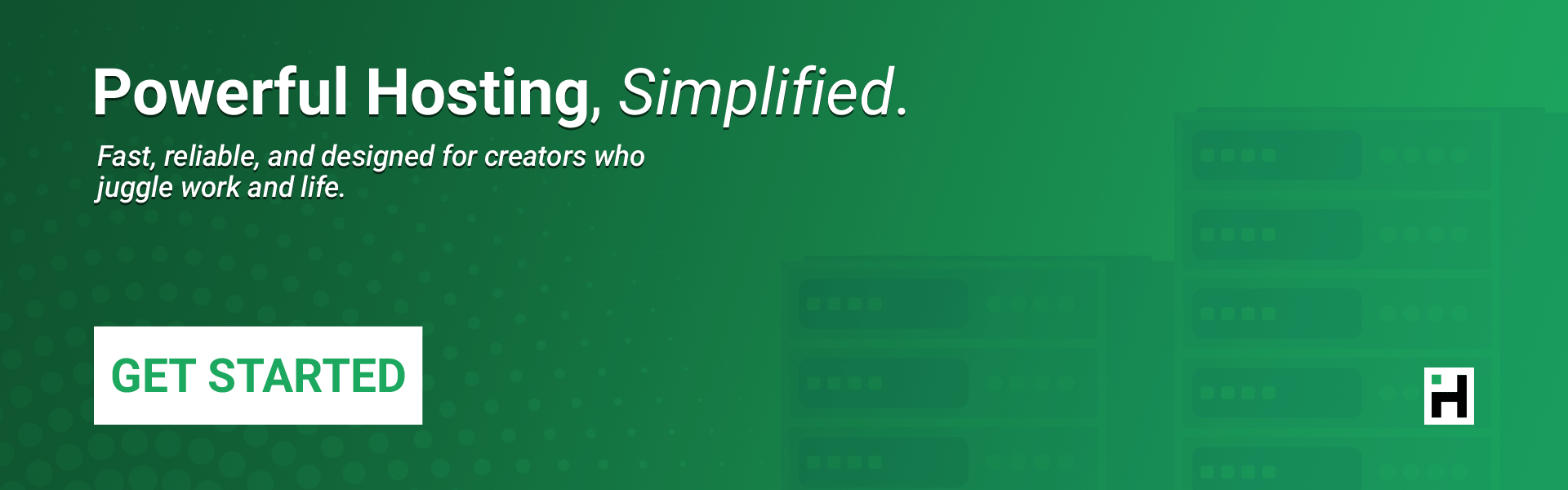
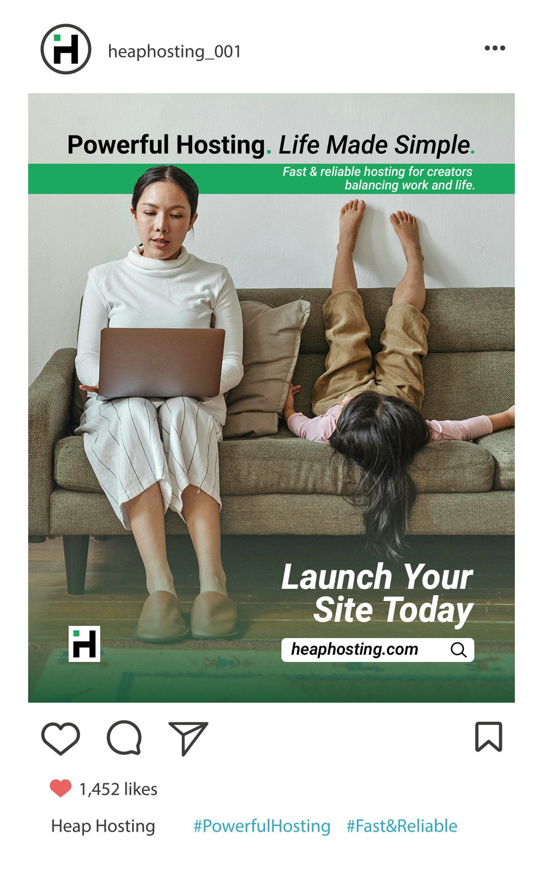
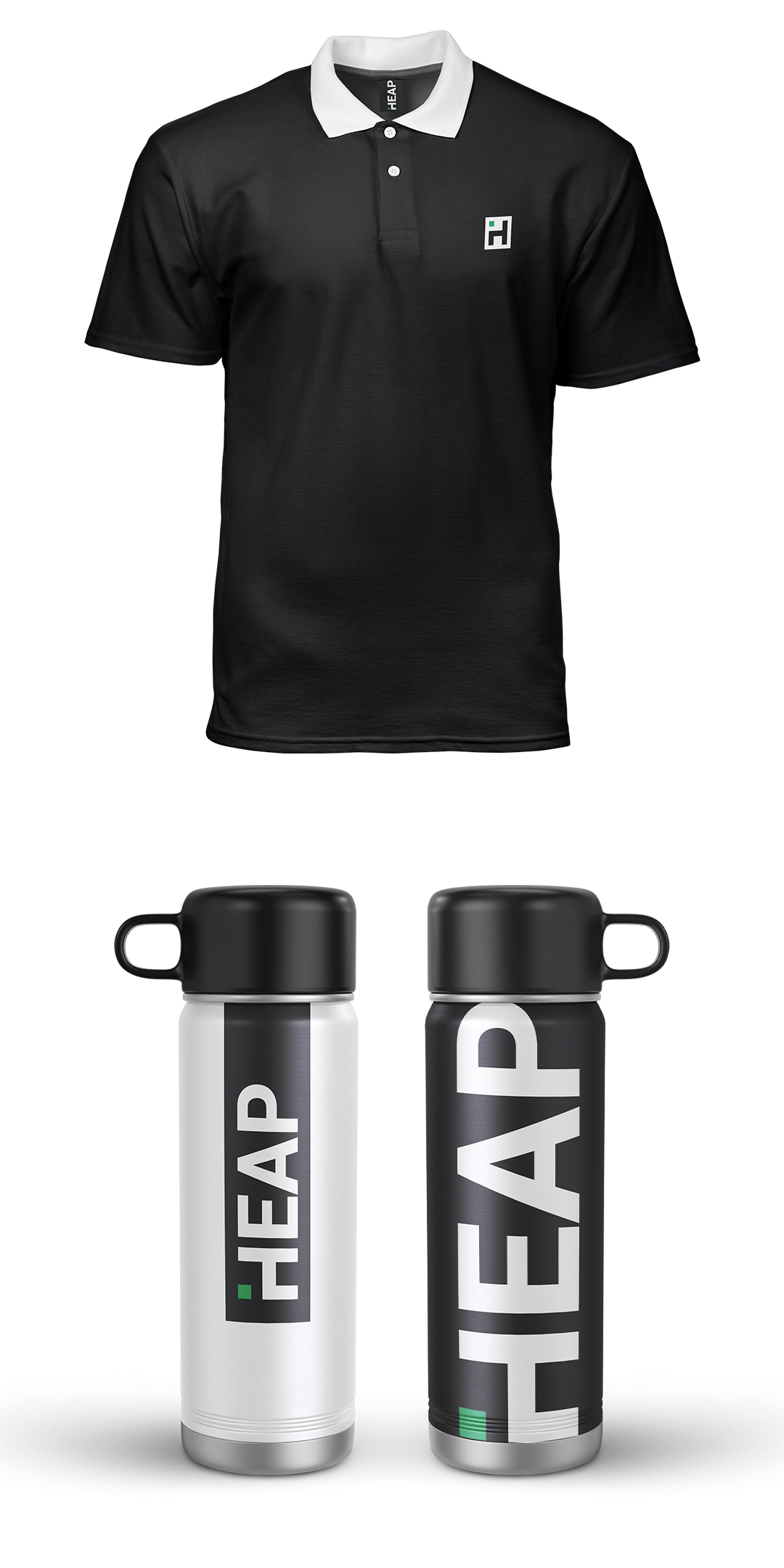
The concept centers around a developer-friendly hosting service that needed a bold yet minimal look to stand out in a crowded digital space. I imagined being approached by the founders to create a brand that could scale visually — across digital ads, hero banners, and even lifestyle merch like mugs and t-shirts.
This case study demonstrates my ability to craft not just a logo, but a cohesive, versatile identity built for both screen and print.